Designing posters for ski resorts is a delicate balance between art and marketing. Designers must capture the spirit and appeal of a ski resort while creating an image that grabs attention and generates interest. Here are some of the key techniques used in designing ski resort posters.
Firstly, color selection plays a crucial role in ski poster design. The colors used must not only accurately represent the landscape of the resort but also create an ambiance that draws the viewer in. Bright and contrasting colors can help make the poster more visible and memorable. For example, a poster for a ski resort known for its vibrant blue skies might use a contrast of vivid blue and white to capture that characteristic.
Effective use of space is also an important technique in ski resort poster design. Designers must balance visual elements like mountain or skier images with the necessary text to provide information about the resort. A good design will utilize space efficiently to create a harmonious and balanced composition.
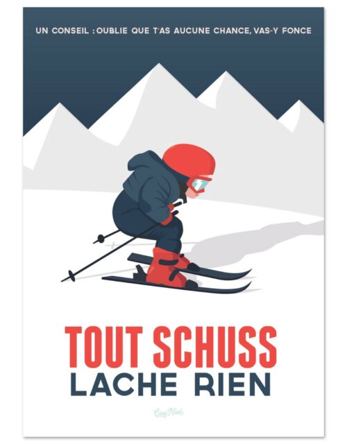
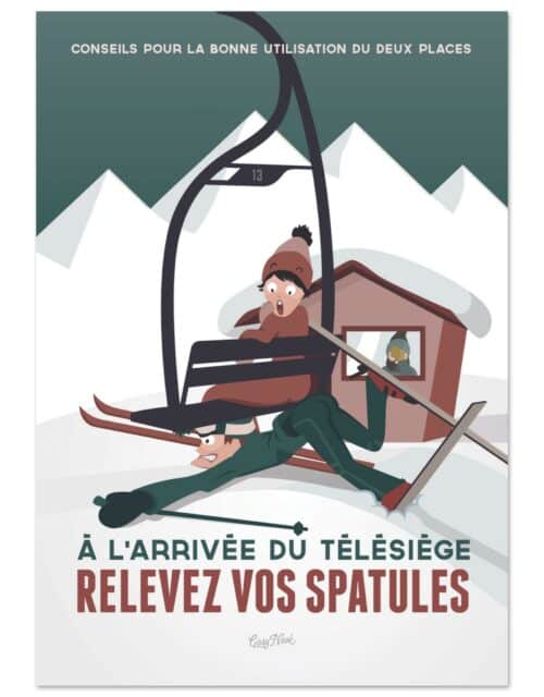
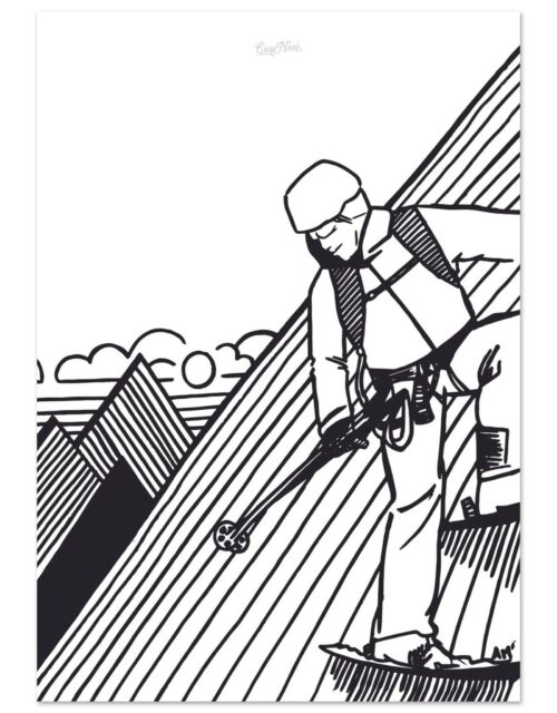
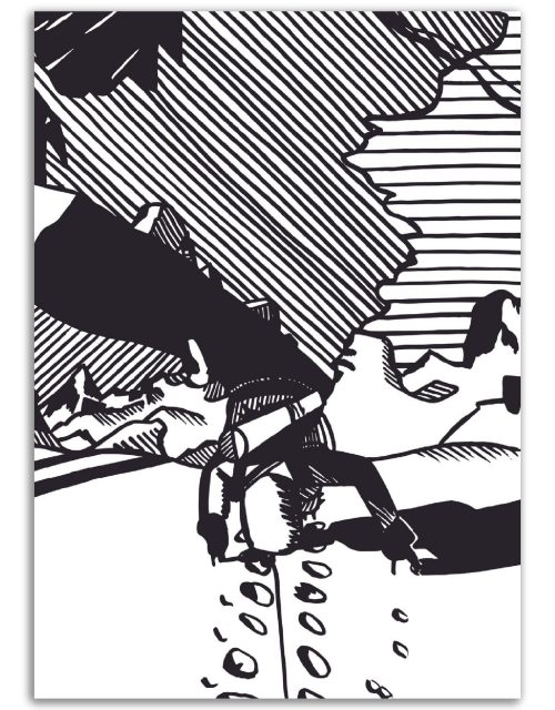
Illustration is another key tool in ski resort poster design. Images can be realistic or stylized, depending on the resort’s aesthetics and target audience. Illustrations can also help evoke the atmosphere of the resort, whether it’s the thrill of black diamond slopes or the tranquility of a mountain chalet.
Typography is also an essential part of ski poster design. The choice of font, size, and style can have a significant impact on the poster’s appearance. Clear and readable typography is important for conveying information, while stylized typography can add character and visual interest to the poster.

Photography is another commonly used technique in ski resort poster design. High-quality photos of the resort’s landscapes, ski slopes, or facilities can help provide a realistic image of what visitors can expect. Additionally, photography can be used to showcase people enjoying the resort, which can help create an emotional connection with the audience.
Lastly, ski resort poster design often involves an element of storytelling. Designers can use images and text to tell a story about the resort, whether it’s its history, unique ambiance, or the experiences it offers. This technique can help create a more comprehensive and appealing image of the resort that goes beyond mere facts and figures.

In summary, designing posters for ski resorts is a complex process that requires a combination of artistic skills and marketing sensibility. Designers must create an image that not only accurately represents the ski resort but is also attractive and memorable to the public. Color choice, use of space, illustration, typography, photography, and storytelling are all techniques that can be used to achieve this goal.
Successful ski resort poster design also requires a deep understanding of the resort’s brand and target audience. For example, a resort positioning itself as a family destination might use warm and inviting images and friendly language in its posters. On the other hand, a resort known for challenging slopes and vibrant après-ski might opt for bolder images and more dynamic language.
Furthermore, designers must stay up-to-date with the latest design and marketing trends to ensure their posters remain fresh and relevant. This may involve following the latest color and typography trends, exploring new illustration or photography techniques, or incorporating interactive elements such as QR codes.

Beyond these specific techniques, the key to successful ski resort poster design is creativity. Each ski resort is unique, with its own personality, landscape, and community. Designers must tap into this uniqueness to create posters that capture the spirit of the resort and resonate with its audience. Whether it’s the thrill of descending a slope, the tranquility of a mountain chalet, or the lively atmosphere of après-ski, a successful poster can capture those moments and make them instantly appealing to potential skiers.
