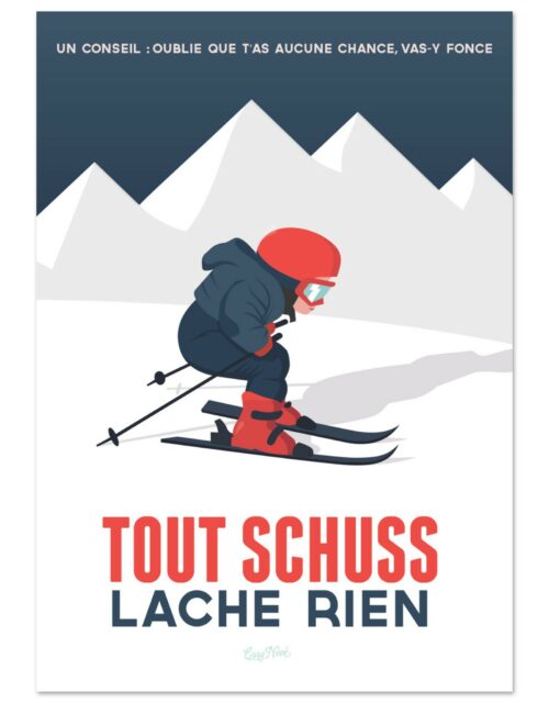
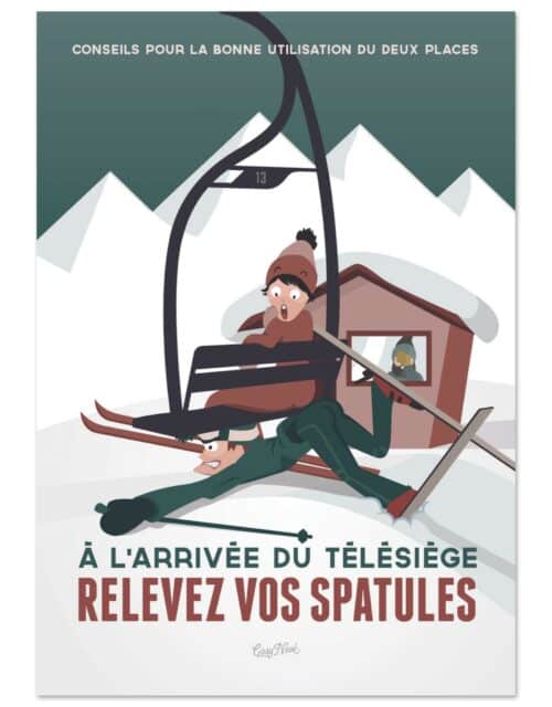
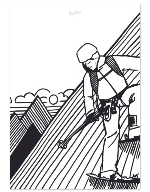
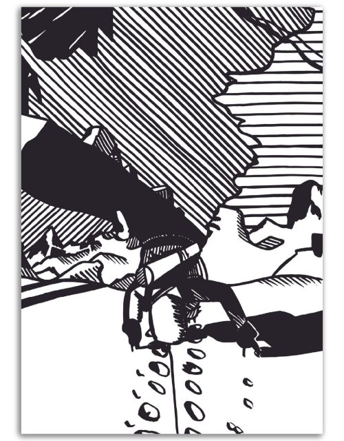
Ski posters are a unique form of art and advertising that capture the spirit of the mountains and the joy of downhill skiing. But what makes a ski poster attractive and effective? Behind every poster lies a subtle and sophisticated science that relies on psychology, visual perception, and principles of graphic design.
PSYCHOLOGICAL APPEAL
The first step in designing an attractive ski poster is understanding what psychologically attracts people to skiing. This can include the desire for adventure, a taste for natural beauty, the appeal of physical fitness, or the pleasure of spending time with friends and family. An attractive ski poster should seek to evoke these feelings and motivations.
COLOR CHOICE
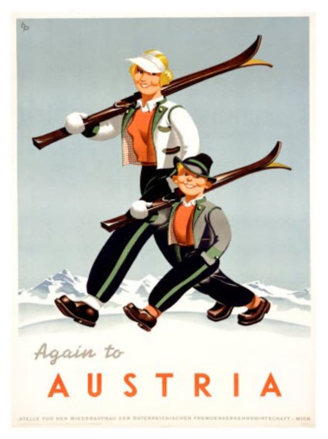
Colors play a crucial role in designing an attractive ski poster. Studies show that colors can influence our emotions and behaviors. For example, blue can evoke feelings of calm and serenity, while red can elicit excitement and energy. By using colors that correspond to the emotions and sensations associated with skiing, designers can create posters that attract and captivate attention.
USE OF IMAGES
Images are another key element in designing an attractive ski poster. Images of majestic mountains, skiers in action, or snowy landscapes can stimulate the imagination and the desire for adventure. Images can also help tell a story, making a poster more memorable and appealing.
TYPOGRAPHY AND MESSAGE
The choice of fonts and the wording of the message are also important in designing an attractive ski poster. Well-chosen typography can help reinforce the tone and atmosphere of the poster. The message should be clear and direct while arousing interest and curiosity.
IMPORTANCE OF PLACEMENT AND COMPOSITION
Placement and composition are essential elements in designing an attractive ski poster. The human eye tends to follow certain paths when looking at an image, a phenomenon known as “eye movement.” By arranging the elements of the poster to guide the viewer’s eye, designers can ensure that all important parts of the poster are seen and taken into account.

IMPORTANCE OF SIMPLICITY
Simplicity is another key factor in creating an attractive ski poster. The most memorable and effective posters are often those that can communicate an idea or feeling in a simple and direct manner. An overly cluttered or complicated design can distract and dilute the main message. Designers therefore strive to maintain clarity in their posters, focusing on a single main idea or image.
MODERN SKI POSTERS: INCORPORATING INNOVATION
The advent of digital technology has opened up new possibilities for ski poster design. Designers now have a range of digital tools at their disposal, allowing them to experiment with animations, 3D effects, and other innovative techniques. While these new technologies offer exciting opportunities, the goal remains the same: to create a poster that captures the essence of skiing and inspires people to explore the slopes.
THE ROLE OF TESTING AND FEEDBACK
Finally, an often overlooked element in designing an attractive ski poster is the role of testing and feedback. Testing different versions of a poster with different audiences can help designers understand which elements work best and which ones need to be modified. Feedback from skiers and other stakeholders can provide valuable insights that can be used to refine and improve the poster.
Conclusion
In summary, designing an attractive ski poster is as much a science as it is an art. It requires a deep understanding of human psychology, principles of visual design, and the intricacies of ski culture. By employing this knowledge, designers can create posters that grab attention, generate interest, and ultimately inspire people to get out and enjoy the pleasures of skiing.
